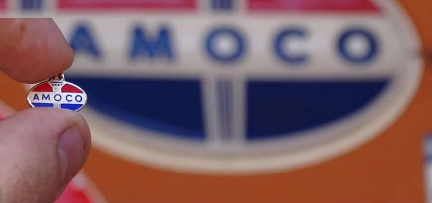
It was October 2017, when BP announced the renaissance of Amoco’s brand, the American historic oil company merged with British Petroleum in 1998 and then gradually disappeared. But… which is its history and, especially, the story of its logo?
The company, originally Standard Oil of Indiana, was founded in 1889 by J. D. Rockefeller; it was one of several companies linked to the powerful Standard Oil. In 1911, Standard was rejected as illegal by antitrust rules, so it was split.
Standard Oil of Indiana managed to survive without problems, and it specialized in fuel distribution in the Midwest. In 1925, it acquired Pan American Petroleum, which was the owner of half of the shares of another company, the American Oil Company (AM.O.CO.): from now, destinies and names of Standard of Indiana and Amoco would be closely interrelated.
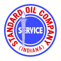
In these years, the history of their logo began; the first one, presented in 1926, had the name of Standard Oil Company (Indiana) in a circle, accompanied by the word “Service” and a torch, which symbolized progress.
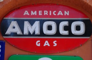
Meanwhile, in 1932, Amoco presented its own logo: two ellipses, red or orange, with the word Amoco, on a black background. So, in a first time, Standard and Amoco kept two different and identifiable marks.
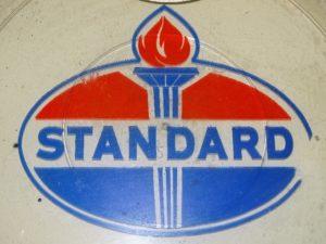
In the post-war period, however, the connection between the two companies became visible also in their symbols; in 1946, Standard revealed the new graphics, with its torch and colours accompanied by the Amoco ellipses.
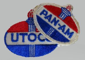
In some states of the USA, the word Standard was replaced, for legal reasons, by the names Pan-Am or Utoco; from 1956 these names were gradually replaced by Amoco trademark, with the same graphic: for the first time, the name of the American Oil was accompanied by Standard torch.

In 1961, the logo was slightly restyled, and the names were regularised: the name Standard (or American, where the first one couldn’t be used) would be used in the USA, while Amoco would spread abroad.
But later Amoco trademark, considered stronger, would return in the USA again, replacing American.

In 1985 the company officially took the name of Amoco Corporation; the logo would remain quite the same in the years, except some little restyling, until its recent disappearance by the will of BP.

So, Amoco disappeared, but its logo continued to circulate in other forms. For example, few knows that in Italy an alternative version was used in recent years by some service stations, part of “Grandi Reti” consortium. We can see this logo in a photo from the magazine “Market Road”, conserved in the Fisogni Museum Archive.
In 2017, finally, BP decided to brush up on the old trademark, reintroducing the historic logo, in a modernised graphics, maintaining the torch and the ellipses, accompanied by the name Amoco, which return today on the signs of service stations.

Marco Mocchetti
Do you want to send us your article about petroliana, oil societies and vintage cars? Contact us!
